 5855b5c03e
## What changes were proposed in this pull request? A minor CSS style change to make Left navigation bar stay fixed with respect to scrolling, it improves usability of the docs. ## How was this patch tested? It was tested on both, firefox and chrome. ### Before 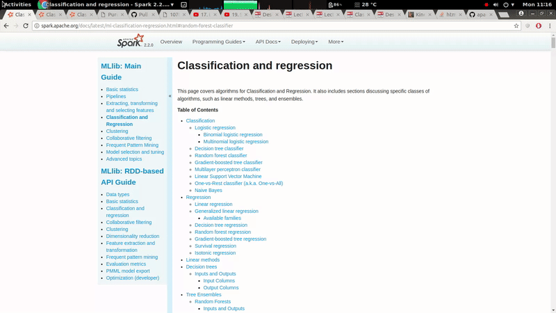 ### After 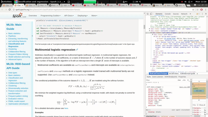 Author: Prashant Sharma <prashsh1@in.ibm.com> Closes #19785 from ScrapCodes/doc/css.
290 lines
5.1 KiB
CSS
Executable file
290 lines
5.1 KiB
CSS
Executable file
/* ==========================================================================
|
|
Author's custom styles
|
|
========================================================================== */
|
|
|
|
.navbar .brand {
|
|
height: 50px;
|
|
width: 110px;
|
|
margin-left: 1px;
|
|
padding: 0;
|
|
}
|
|
|
|
.version {
|
|
line-height: 30px;
|
|
vertical-align: bottom;
|
|
font-size: 12px;
|
|
padding: 0;
|
|
margin: 0;
|
|
font-weight: bold;
|
|
color: #777;
|
|
}
|
|
|
|
.navbar-inner {
|
|
padding-top: 2px;
|
|
height: 50px;
|
|
}
|
|
|
|
.navbar-inner .nav {
|
|
margin-top: 5px;
|
|
font-size: 15px;
|
|
}
|
|
|
|
.navbar .divider-vertical {
|
|
border-right-color: lightgray;
|
|
}
|
|
|
|
.navbar-text .version-text {
|
|
color: #555555;
|
|
padding: 5px;
|
|
margin-left: 10px;
|
|
}
|
|
|
|
body .container-wrapper {
|
|
background-color: #FFF;
|
|
color: #1D1F22;
|
|
max-width: 1024px;
|
|
margin-top: 10px;
|
|
margin-left: auto;
|
|
margin-right: auto;
|
|
border-radius: 15px;
|
|
position: relative;
|
|
}
|
|
|
|
.title {
|
|
font-size: 32px;
|
|
}
|
|
|
|
h1 {
|
|
font-size: 28px;
|
|
margin-top: 12px;
|
|
}
|
|
|
|
h2 {
|
|
font-size: 24px;
|
|
margin-top: 12px;
|
|
}
|
|
|
|
h3 {
|
|
font-size: 21px;
|
|
margin-top: 10px;
|
|
}
|
|
|
|
pre {
|
|
font-family: "Menlo", "Lucida Console", monospace;
|
|
}
|
|
|
|
code {
|
|
font-family: "Menlo", "Lucida Console", monospace;
|
|
background: white;
|
|
border: none;
|
|
padding: 0;
|
|
color: #444444;
|
|
}
|
|
|
|
div .highlight pre {
|
|
font-size: 12px;
|
|
}
|
|
|
|
a code {
|
|
color: #0088cc;
|
|
}
|
|
|
|
a:hover code {
|
|
color: #005580;
|
|
text-decoration: underline;
|
|
}
|
|
|
|
.container {
|
|
max-width: 914px;
|
|
}
|
|
|
|
.content {
|
|
z-index: 1;
|
|
position: relative;
|
|
background-color: #FFF;
|
|
max-width: 914px;
|
|
line-height: 1.6; /* Inspired by Github's wiki style */
|
|
padding-left: 15px;
|
|
}
|
|
|
|
.content-with-sidebar {
|
|
z-index: 1;
|
|
position: relative;
|
|
background-color: #FFF;
|
|
max-width: 914px;
|
|
line-height: 1.6; /* Inspired by Github's wiki style */
|
|
padding-left: 30px;
|
|
}
|
|
|
|
.dropdown-menu {
|
|
/* Remove the default 2px top margin which causes a small
|
|
gap between the hover trigger area and the popup menu */
|
|
margin-top: 0;
|
|
/* Avoid too much whitespace at the right for shorter menu items */
|
|
min-width: 50px;
|
|
}
|
|
|
|
/**
|
|
* Make dropdown menus in nav bars show on hover instead of click
|
|
* using solution at http://stackoverflow.com/questions/8878033/how-
|
|
* to-make-twitter-bootstrap-menu-dropdown-on-hover-rather-than-click
|
|
**/
|
|
ul.nav li.dropdown:hover ul.dropdown-menu{
|
|
display: block;
|
|
}
|
|
|
|
a.menu:after, .dropdown-toggle:after {
|
|
content: none;
|
|
}
|
|
|
|
/** Make the submenus open on hover on the parent menu item */
|
|
ul.nav li.dropdown ul.dropdown-menu li.dropdown-submenu:hover ul.dropdown-menu {
|
|
display: block;
|
|
}
|
|
|
|
/** Make the submenus be invisible until the parent menu item is hovered upon */
|
|
ul.nav li.dropdown ul.dropdown-menu li.dropdown-submenu ul.dropdown-menu {
|
|
display: none;
|
|
}
|
|
|
|
/**
|
|
* Made the navigation bar buttons not grey out when clicked.
|
|
* Essentially making nav bar buttons not react to clicks, only hover events.
|
|
*/
|
|
.navbar .nav li.dropdown.open > .dropdown-toggle {
|
|
background-color: transparent;
|
|
}
|
|
|
|
/**
|
|
* Made the active tab caption blue. Otherwise the active tab is black, and inactive tab is blue.
|
|
* That looks weird. Changed the colors to active - blue, inactive - black, and
|
|
* no color change on hover.
|
|
*/
|
|
.nav-tabs > .active > a, .nav-tabs > .active > a:hover {
|
|
color: #08c;
|
|
}
|
|
|
|
.nav-tabs > li > a, .nav-tabs > li > a:hover {
|
|
color: #333;
|
|
}
|
|
|
|
/**
|
|
* MathJax (embedded latex formulas)
|
|
*/
|
|
.MathJax .mo { color: inherit }
|
|
.MathJax .mi { color: inherit }
|
|
.MathJax .mf { color: inherit }
|
|
.MathJax .mh { color: inherit }
|
|
|
|
/**
|
|
* AnchorJS (anchor links when hovering over headers)
|
|
*/
|
|
a.anchorjs-link:hover { text-decoration: none; }
|
|
|
|
|
|
/**
|
|
* The left navigation bar.
|
|
*/
|
|
.left-menu-wrapper {
|
|
margin-left: 0px;
|
|
margin-right: 0px;
|
|
background-color: #F0F8FC;
|
|
border-top-width: 0px;
|
|
border-left-width: 0px;
|
|
border-bottom-width: 0px;
|
|
margin-top: 0px;
|
|
width: 210px;
|
|
float: left;
|
|
position: fixed;
|
|
}
|
|
|
|
.left-menu {
|
|
padding: 0px;
|
|
width: 199px;
|
|
}
|
|
|
|
.left-menu h3 {
|
|
margin-left: 10px;
|
|
line-height: 30px;
|
|
}
|
|
|
|
/**
|
|
* The collapsing button for the navigation bar.
|
|
*/
|
|
.nav-trigger {
|
|
position: fixed;
|
|
clip: rect(0, 0, 0, 0);
|
|
}
|
|
|
|
.nav-trigger + label:after {
|
|
content: '»';
|
|
}
|
|
|
|
label {
|
|
z-index: 10;
|
|
}
|
|
|
|
label[for="nav-trigger"] {
|
|
position: fixed;
|
|
margin-left: 0px;
|
|
padding-top: 100px;
|
|
padding-left: 5px;
|
|
width: 10px;
|
|
height: 80%;
|
|
cursor: pointer;
|
|
background-size: contain;
|
|
background-color: #D4F0FF;
|
|
}
|
|
|
|
label[for="nav-trigger"]:hover {
|
|
background-color: #BEE9FF;
|
|
}
|
|
|
|
.nav-trigger:checked + label {
|
|
margin-left: 200px;
|
|
}
|
|
|
|
.nav-trigger:checked + label:after {
|
|
content: '«';
|
|
}
|
|
|
|
.nav-trigger:checked ~ div.content-with-sidebar {
|
|
margin-left: 200px;
|
|
}
|
|
|
|
.nav-trigger + label, div.content-with-sidebar {
|
|
transition: left 0.4s;
|
|
}
|
|
|
|
/**
|
|
* Rules to collapse the menu automatically when the screen becomes too thin.
|
|
*/
|
|
|
|
@media all and (max-width: 780px) {
|
|
|
|
div.content-with-sidebar {
|
|
margin-left: 200px;
|
|
}
|
|
.nav-trigger + label:after {
|
|
content: '«';
|
|
}
|
|
label[for="nav-trigger"] {
|
|
margin-left: 200px;
|
|
}
|
|
|
|
.nav-trigger:checked + label {
|
|
margin-left: 0px;
|
|
}
|
|
.nav-trigger:checked + label:after {
|
|
content: '»';
|
|
}
|
|
.nav-trigger:checked ~ div.content-with-sidebar {
|
|
margin-left: 0px;
|
|
}
|
|
|
|
div.container-index {
|
|
margin-left: -215px;
|
|
}
|
|
|
|
}
|